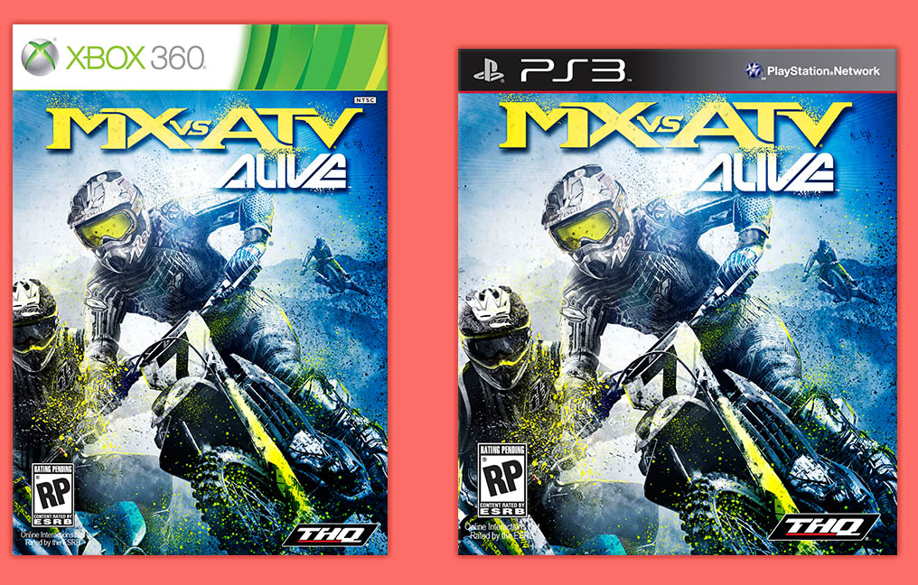
MX vs ATV ALIVE
2011 | Art Direction | Rainbow | PS3 & Xbox 360

SUMMARY
This was my last of three games I art directed for the franchise. We were asked to develop the game in record time with a slim budget while also adopting a new marketing direction to capitalize on downloadable content.
Chief Accomplishments:
- Art directed another game title with minimal budget, team, and time.
- Delivered new visual innovations for the franchise
- Close collaboration with marketing on product identity.
PROPOSAL
Created an off road motorbike and ATV racing title to add to this +10M selling franchise. Utilize our seasoned expertise and technology to represent the feeling and exhilaration of riding machines tearing through dirt. We had 9 months to do it, from concept to delivery.
INITIAL DIRECTION
The visual themes represented ‘the big weekend at the local track as told through an idealistic memory’. It representing the highlights of the underground motocross lifestyle in a hyper realistic setting that inspires the player while simultaneously meeting the vehicle manufacturers and vendors need for authenticity and branding.

LOOK DEVELOPMENT
The goal is for an instant recognition of the game if seen as a screenshot or glimpse. Stronger profiles and visual relationships created between the rider and the vehicle with a more defining silhouette. The color treatment would showcase the environments unique identity.
ENVIRONMENT ART
There were two types of activities in the game, the freeride where a rider could roam an open world with their friends, and dirt track based racing.
Once the levels were defined, I established a vision wall that anybody could reference at any time. Below is an example of what that definition was for one of the levels:
TROPIC ISLAND
Location: Hawaiian like island, featuring valley and ocean vistas, a deep bamboo jungle, red clay surface, loose volcanic rock and a grass plain.
Color Palette: The greens are nearly glowing in the morning sun, the red earth is prominent throughout the level.
Lighting: Summer mid-morning, stark low yellow sun, strong contrast, light punctuates the tropic saturation and humidity.
Environmental Effects: The humidity will be shown through distance fog, the flare and bloom settings will have a softer tone.
Environmental Animations: A light wind through the level pushes the flags and banners around. Clouds of insects are present on the lit areas of the track.
Track Side Objects:Used tires and banners improvised from poles and ropes. pennant banners line the course. The only sign of organized competition and sponsors are through the banners and overhead signs, perhaps an inflatable sponsors object as well.
Final Look: Below are a selection of images from the completed environment
CHARACTER ART
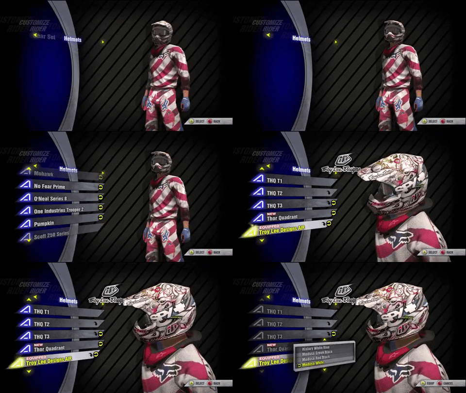
There were three main areas of focus for this department, the rider(s), the customization gear for them, and the NPCs (non player characters). The gear is supplied by sponsors and partners, adjusting their style is off limits.
RIDER
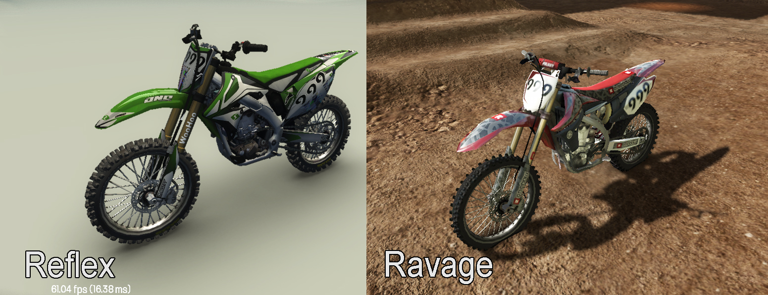
We increased the efficiency in our rider model over the previous game by reduced polygon counts and replaced/increased perceptive detail through visual tricks.

For the rider, identity is an critical part of the lifestyle. Butt patches were a component of this, these fabric patches are sewn on the, well, go figure.
There were a couple of freeride specific vehicles to design too, a large 650cc bike in the Welsh quarry, and an insanely tuned paddle tired turbo’d ATV on the beach.
The team built a huge selection of parts and accessories that the game was known for. With tech art, the team introduced a series of new shaders too, giving them more prominence and shine.

The start of the race would follow a pattern of showing the 30 second board girl, then one camera move zooms out then back into the playable camera position.
On race completion, we had a sequence that would summarize the race results and celebrate the moment.
FRANCHISE LOGO
To match the fresh, simpler, back-to-the-roots vision of Alive, I redesigned the logo to fit the theme and be more flexible with its usage.


